

Every ERP project stalls at the same point: nobody can agree on how the current process actually works. Finance thinks the close takes five days, operations knows it takes nine, and the gap gets discovered mid-implementation instead of before it. Business process mapping techniques exist to close that gap before you spend a dollar on new software.
If you’re trying to document workflows or figure out which mapping method fits your situation, the answer depends on what you need to show. A simple flowchart works for a linear approval process. A swimlane diagram earns its keep when three departments touch the same invoice. BPMN, value stream mapping, and SIPOC each solve a different visibility problem, and picking the wrong one wastes time redrawing diagrams your team won’t use.
This article walks through seven techniques we rely on before every NetSuite and Acumatica engagement, because an ERP built on an undocumented process just automates the chaos. You’ll get a clear picture of when to use each method, so your next system rollout starts from an accurate map instead of a guess.
1. Basic flowcharts
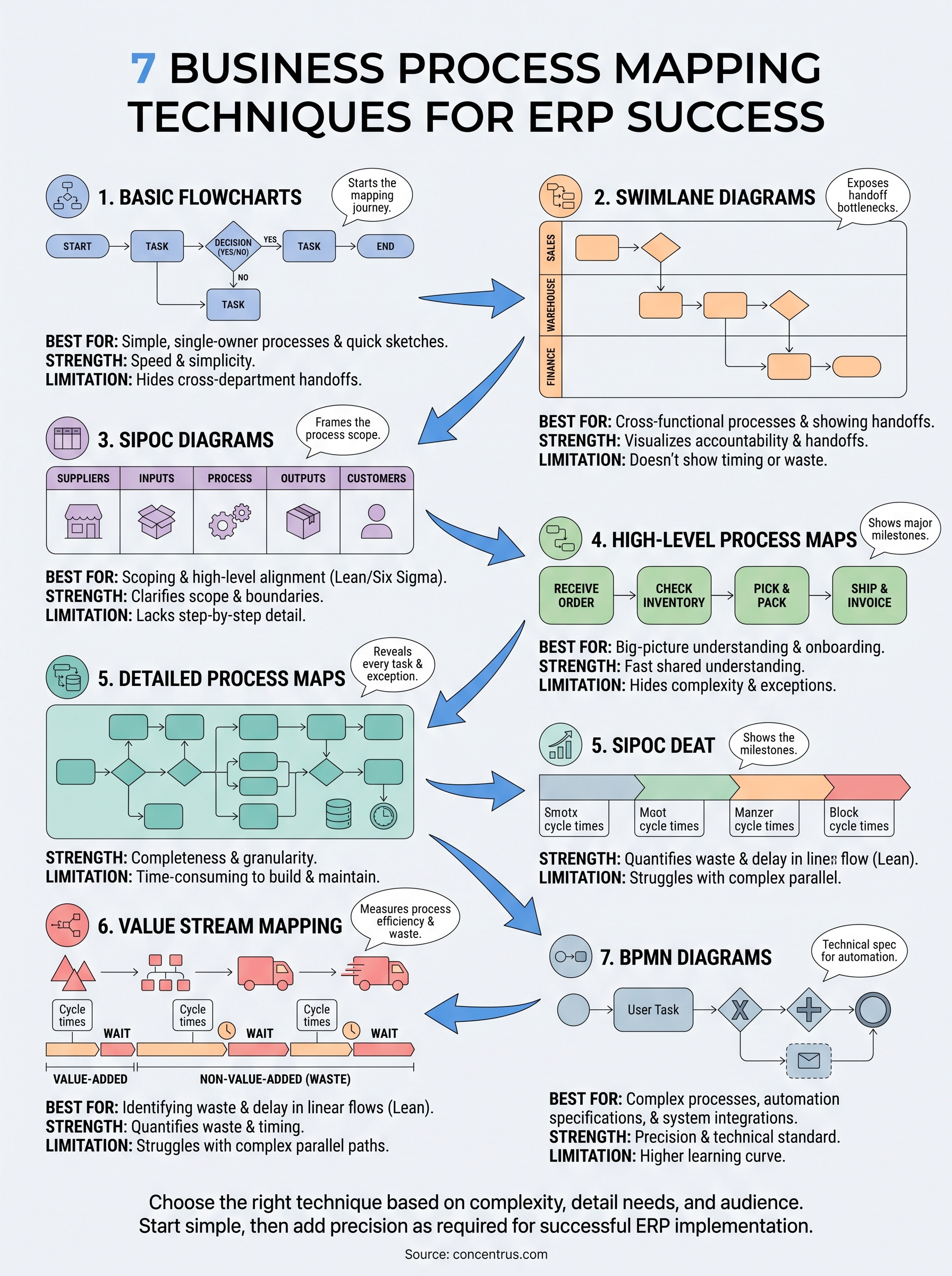
A basic flowchart is the starting point for almost every process documentation effort, and for good reason. It uses a small set of shapes, ovals for start and end points, rectangles for tasks, diamonds for decisions, connected by arrows that show the sequence of steps. Basic flowcharts strip a process down to its bones, which makes them the fastest of all the business process mapping techniques to sketch on a whiteboard during a discovery call.
How it works
You map the process left to right or top to bottom, one shape per action or decision. Each decision diamond forks into a yes/no or true/false path, so the reader can trace exactly what happens when an approval gets rejected or an order fails a credit check. No lanes, no roles, no systems, just the raw sequence of what happens next. That simplicity is the entire point: anyone in the room, from a warehouse supervisor to a CFO, can follow the diagram without a legend.
Best for
Basic flowcharts fit single-owner processes where one person or one team controls every step from start to finish. Think of a purchase requisition under $500, a simple expense reimbursement, or a password reset workflow. They also work well as a first pass before you commit to a more detailed technique, since sketching the linear version often reveals whether the process is actually simple or secretly cross-functional.
- Documenting a straightforward approval chain
- Training new hires on a single task
- Kicking off a discovery session before choosing a heavier mapping method
- Capturing a process with fewer than 10 steps and no handoffs between departments
Strengths and limitations
Speed is the flowchart’s biggest strength. You can build one in a working session using sticky notes and have a draft on the wall in twenty minutes. Tools like Microsoft Visio or even a whiteboard photo are enough; you don’t need specialized process modeling software to get value from this technique.
If a process touches more than one department, a basic flowchart will hide the handoff problems instead of exposing them.
The limitation shows up the moment a process crosses department lines. A flowchart has no way to show who owns each step, so when finance, sales, and warehouse staff all touch the same order, the diagram either gets cluttered with labels bolted onto every box or it quietly glosses over where the ball actually gets dropped. We see this constantly during ERP rescues: a client’s “documented process” turns out to be a flowchart that never captured which department caused the bottleneck. That’s exactly the gap swimlane diagrams are built to close.
2. Swimlane diagrams
A swimlane diagram takes the same shapes as a basic flowchart and adds one critical dimension: ownership. Swimlane diagrams organize a process into horizontal or vertical bands, one lane per department, role, or system, so every step sits inside the lane of whoever performs it. This is the technique we reach for most often during ERP discovery, because it turns a vague complaint like “the order process is slow” into a visible map of exactly where the handoff breaks down.

How it works
Start by listing every role or department that touches the process, sales, warehouse, accounts payable, whatever applies, and give each one its own lane. Then place each task or decision in the lane of the person who owns it, connecting steps with arrows that cross lanes whenever the work hands off. Those cross-lane arrows are the whole point: each handoff becomes a visible line instead of a hidden assumption, so you can count how many times a single order bounces between departments before it closes.
Best for
Swimlane diagrams fit any process where more than one department or system plays a role. Common use cases include:
- Order-to-cash cycles that touch sales, warehouse, and finance
- Procure-to-pay workflows involving requesters, approvers, and AP
- Any process where you suspect duplicate work or approval bottlenecks between teams
Strengths and limitations
A swimlane diagram turns “the process is slow” into a visible count of every handoff that slows it down.
The strength here is accountability. Once a process is drawn in lanes, nobody can argue about who owns a delayed step because the diagram shows it. The limitation is that swimlanes still describe sequence and ownership, not volume, timing, or waste, which means they won’t tell you how long each handoff actually takes. For that level of detail, you need a detailed process map or, if the bottleneck is really about speed and inventory, value stream mapping.
3. SIPOC diagrams
A SIPOC diagram steps back from the step-by-step sequence entirely and frames a process at the boundary level: Suppliers, Inputs, Process, Outputs, Customers. SIPOC diagrams don’t show individual tasks or decisions at all. Instead, they answer a much simpler question first: what goes into this process, what comes out of it, and who’s on each end? That framing makes SIPOC less of a flowchart and more of a scoping tool, one that belongs at the very start of a mapping effort rather than as a replacement for it.
How it works
You build a SIPOC as a simple table with five columns, filling in each one before you draw a single arrow. Suppliers are whoever provides the inputs, vendors, other departments, or systems. Inputs are the materials, data, or approvals the process needs to start. The Process column stays high-level, usually just four or five major phases, not individual steps. Outputs are what the process produces, and Customers are whoever receives that output, internal or external. Teams typically fill this out collaboratively in under an hour, because the level of detail stays intentionally shallow.
Best for
SIPOC earns its place at kickoff meetings, especially in Six Sigma and Lean projects, where a team needs to agree on scope before diving into detail. It suits complex, unfamiliar processes where nobody has consensus yet on where the process even begins or ends, and it works well for executive audiences who need context, not mechanics.
Strengths and limitations
A SIPOC diagram earns its value in the first hour of a project, not the last.
The strength is alignment: everyone leaves the session agreeing on scope. The limitation is depth. A SIPOC can’t show handoffs, decisions, or bottlenecks, so you’ll still need a swimlane or detailed process map afterward to document how the work actually happens.
4. High-level process maps
A high-level process map sits between a SIPOC and a full flowchart, showing the major phases of a process without drilling into every task. High-level process maps typically capture five to eight boxes that represent whole stages, like “receive order,” “check inventory,” “pick and pack,” and “invoice customer,” rather than every click a warehouse clerk makes along the way. This makes it one of the more approachable business process mapping techniques for teams who need a shared picture fast, not a technical spec.
How it works
You start by identifying the major milestones a process passes through from trigger to completion, then connect them with simple arrows in sequence. Each box usually represents a phase that could contain ten or more sub-steps, but those details stay out of the diagram on purpose. Milestone boxes replace individual tasks, and decision points only appear if they change the overall path, not every minor exception.
Best for
High-level maps work well for onboarding new hires to a department, briefing executives on how a function operates, or kicking off a bigger mapping project before anyone commits to detailed diagramming. They also help cross-functional teams agree on the big picture before arguing over specifics.
Strengths and limitations
Speed and shared understanding are the payoff here. A team can build one on a single page and everyone, from a CFO to a new analyst, can follow it in minutes.
A high-level process map gives everyone the same big picture before anyone argues over the details.
Limitations show up fast once someone asks “why does step three take three days?” The map has no answer, because it was never built to hold that much detail. For that, you need a detailed process map.
5. Detailed process maps
A detailed process map picks up exactly where the high-level version leaves off. Detailed process maps break every phase down into the individual tasks, decisions, systems, and handoffs that actually happen, often with dozens of shapes covering a process that a high-level map summarized in five boxes. This is the technique that finally answers “why does step three take three days,” because it shows the wait, the approval, and the rework loop hiding inside that single high-level box.
How it works
You expand each milestone from the high-level map into its component steps, capturing every task, decision diamond, system touchpoint, and wait time in sequence. Analysts typically interview the people who actually do the work, not just their managers, because the documented procedure and the real one rarely match. Every exception path gets its own branch, whether that’s a rejected credit check, a backordered SKU, or a manual override in the ERP, so the diagram reflects reality instead of the policy manual.
Best for
Detailed process maps fit situations where you need to redesign a process, not just describe it. They’re the right tool before an ERP configuration decision, during a root-cause investigation into a recurring bottleneck, or when documenting a process for compliance audits that require step-level evidence.
Strengths and limitations
The strength is completeness. Nothing gets left to assumption, which is exactly why we insist on this level of detail before configuring approval workflows or automation rules in NetSuite or Acumatica.
A detailed process map is the only technique granular enough to configure ERP workflows against, because guesses don’t survive contact with real approval rules.
The tradeoff is time and maintenance. A detailed map for a complex process can run to several pages and take days to build and validate, and it goes stale the moment the real process changes. If your goal is spotting waste and delay rather than documenting every click, value stream mapping gets you there faster.
6. Value stream mapping
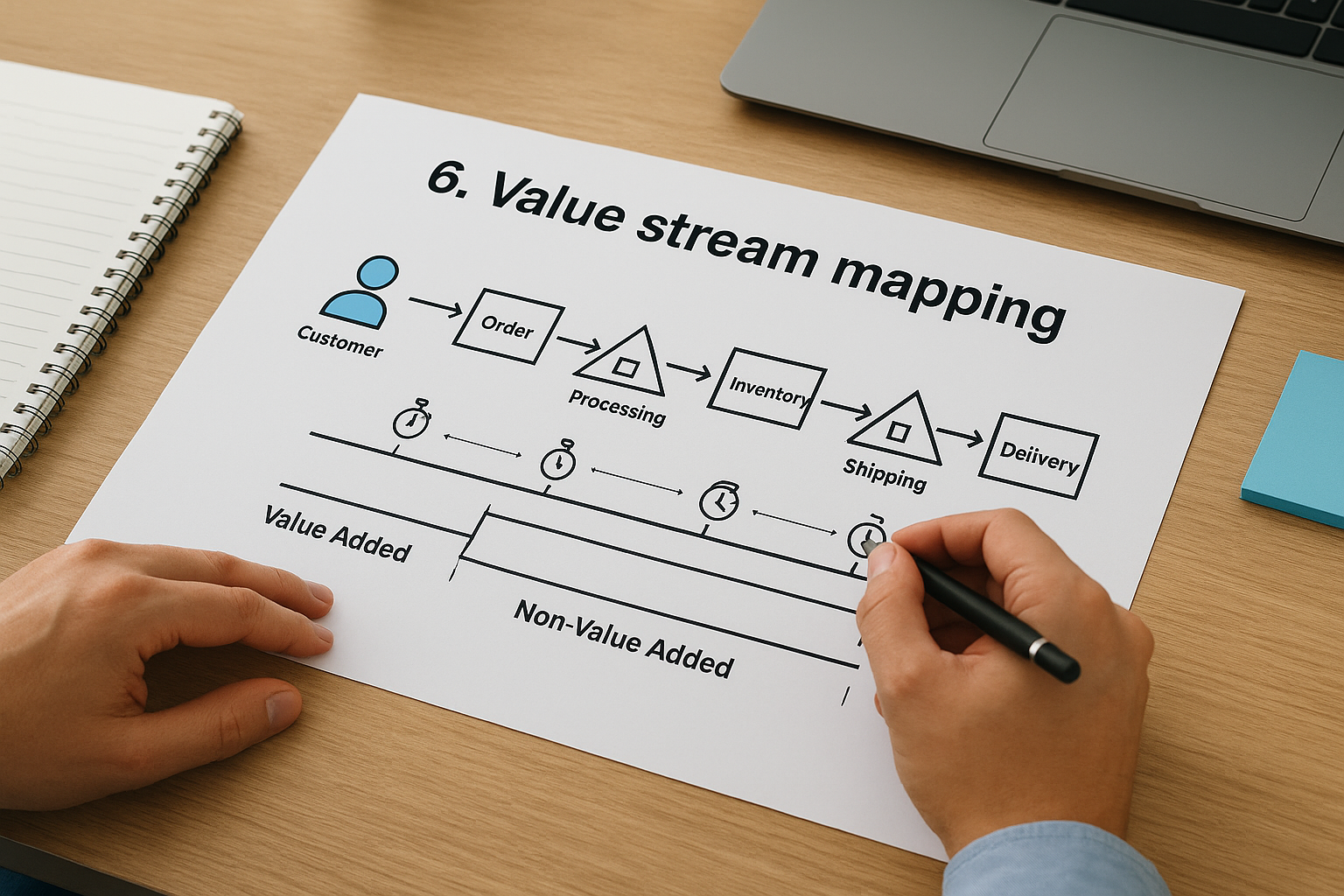
Value stream mapping started on Toyota’s factory floor and it still carries that Lean DNA: every step gets judged by whether it adds value or just adds time. Value stream mapping tracks the flow of material and information through a process while layering in timing data, cycle time, wait time, and inventory at each stage, so you can see exactly where work sits idle instead of moving. Where a detailed process map shows you every step, a value stream map tells you which of those steps are actually worth keeping.
How it works
You map the flow from customer order back to raw material (or the reverse), noting the cycle time and wait time at each stage using a standard set of icons for inventory, transport, and information flow. A timeline runs along the bottom of the diagram, splitting total lead time into value-added time and non-value-added time. That split is the payoff: it quantifies waste instead of just describing it, which is exactly what distinguishes value stream mapping from the other business process mapping techniques on this list.
Best for
Value stream mapping suits manufacturing and supply chain processes where inventory, lead time, and throughput drive the bottom line. It’s also useful for order fulfillment and procurement cycles where you suspect the delay isn’t in any single step but in the wait time between steps.
- Manufacturing floor processes with physical inventory
- Order fulfillment cycles with long lead times
- Any process a Lean or Kaizen initiative is targeting for waste reduction
Strengths and limitations
The strength is quantification. You get a number, not a guess, for how much of your cycle time is actually waste.
Value stream mapping is the only technique on this list that puts a number on waste instead of just pointing at it.
The limitation is scope: it assumes a linear, largely sequential flow, so it struggles with processes full of parallel paths, exceptions, and conditional logic. For that kind of complexity, BPMN is the sharper tool.
7. BPMN diagrams
Business Process Model and Notation, BPMN for short, is the most rigorous of the business process mapping techniques covered here. It uses a standardized set of symbols, defined by the Object Management Group, so a diagram built in one tool means exactly the same thing when opened in another. That standardization matters once a process map stops being a discussion aid and starts being a technical specification that a developer or integration platform reads directly.
How it works
BPMN expands on flowchart logic with a formal vocabulary: events (circles) that trigger or end a process, activities (rounded rectangles) that represent work, and gateways (diamonds) that model parallel paths, exclusive choices, and looping logic far more precisely than a basic decision diamond. Pools and lanes group tasks by participant, much like a swimlane diagram, but BPMN adds message flows between pools to show communication across organizational boundaries, like a customer submitting an order into a supplier’s system.
Best for
BPMN suits processes with genuine complexity, multiple parallel branches, exception handling, or system-to-system messaging, and it’s the natural choice when the diagram will feed a workflow automation tool or an integration platform rather than just inform a training session. Teams building automation rules ahead of an ERP rollout, or documenting a process that spans several software systems, get the most value here.
Strengths and limitations
Precision is BPMN’s strength; nothing in the notation is open to interpretation, which is why it translates cleanly into automated workflows.
BPMN is the only technique on this list precise enough to hand directly to a developer without a conversation first.
The tradeoff is a learning curve. Untrained stakeholders often need a walkthrough before a BPMN diagram makes sense, so it’s rarely the right starting point for a discovery session.
Choosing the right technique for your team
Start simple, then add complexity only when the process demands it. Sketch a basic flowchart first, watch for cross-department handoffs, and reach for a swimlane diagram the moment you spot them. Use SIPOC to scope an unfamiliar process before you map it, and save value stream mapping or BPMN for the situations that actually need timing data or automation-ready precision. None of these business process mapping techniques matters if nobody uses the diagram once it’s drawn, so pick the lightest tool that still tells the truth about how work moves through your organization.
Mapping the process is step one. The harder part is making sure the ERP system you build on top of it actually protects the ROI you’re counting on, instead of automating a workflow nobody validated. That’s the gap Concentrus closes on every NetSuite and Acumatica engagement. If your next rollout needs an accurate map and a guaranteed return, talk to Concentrus before you write a single line of configuration.