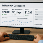
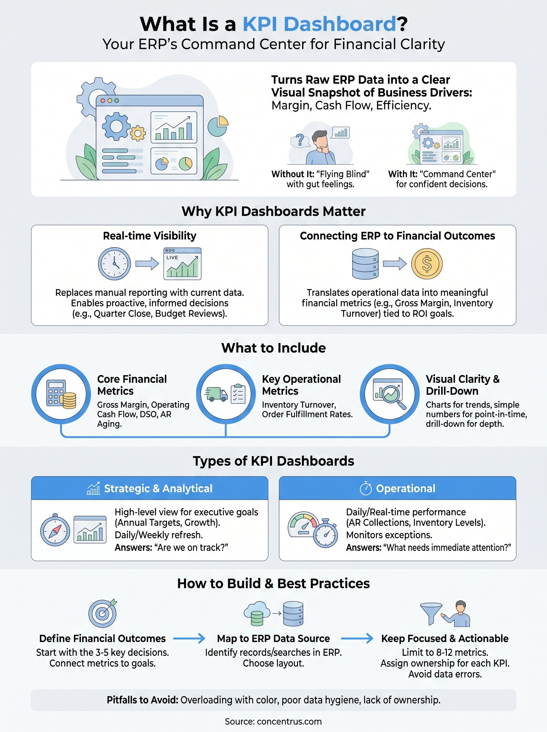
Every ERP implementation generates data, but data without visibility is just noise. That’s exactly why understanding what is a KPI dashboard matters so much for finance leaders at midsized companies. A KPI dashboard turns raw ERP data into a clear, visual snapshot of the metrics that actually drive your business: margin performance, cash flow trends, close times, and operational efficiency.
At Concentrus, we build ROI accountability into every NetSuite and Acumatica implementation we deliver. A well-designed KPI dashboard is central to that promise because it’s how CFOs and controllers track whether their ERP investment is paying off, in real numbers, not gut feelings. Without one, you’re flying blind. With the right one, you have a command center for confident decision-making.
This article breaks down the types of KPI dashboards, walks through real examples, and covers the best practices that separate useful dashboards from decorative ones. Whether you’re planning a new ERP implementation or trying to get more value from a system that’s already live, this guide will help you understand what to build, why it matters, and how to make it work for your team.
Why KPI dashboards matter for finance teams
Finance teams at midsized companies deal with more data than ever, but volume alone doesn’t translate into better decisions. Without a structured way to surface what matters, your team ends up pulling reports manually, reconciling numbers from multiple sources, and spending hours answering questions that a well-built dashboard could answer in seconds. Understanding what is a KPI dashboard is the starting point for turning that problem around.
Real-time visibility replaces manual reporting
When your team relies on static reports pulled at month-end, you’re always looking at the past. A KPI dashboard changes that by giving you live or near-live access to the numbers that drive your business. Instead of waiting for a finance analyst to compile a cash flow summary, your CFO can open a dashboard and see current AR aging, days sales outstanding, and operating cash position in a single view.
Real-time visibility doesn’t just save time; it fundamentally changes the quality of decisions your leadership team can make.
This shift matters most during critical periods like quarter close, budget reviews, or when leadership needs to respond quickly to a drop in revenue or a spike in costs. With accurate, current data in front of them, your team moves from reactive to proactive, which is exactly where finance leadership should operate.
Connecting ERP data to financial outcomes
Most ERP systems hold an enormous amount of operational data. The problem is that data sitting inside an ERP is not automatically useful to a CFO or controller who needs to answer strategic questions. A KPI dashboard acts as the translation layer between raw system data and the meaningful financial metrics tied to outcomes you actually care about: gross margin, inventory turnover, close cycle time, and headcount cost per revenue dollar.
At Concentrus, this connection between ERP data and financial outcomes is built into every implementation through the ROI Roadmap methodology. Your dashboards should reflect the specific KPIs that define success for your business, not generic metrics copied from a template. When your ERP and your dashboard are properly aligned, you can track whether your technology investment is delivering its promised return and course-correct quickly when it falls short.
What to include in a KPI dashboard
The best way to think about what is a KPI dashboard is as a curated set of metrics, not a data dump. Including too many numbers defeats the purpose entirely. Your dashboard should surface the handful of KPIs that directly connect to your business goals, organized so your team can absorb them quickly without digging through layers of data.
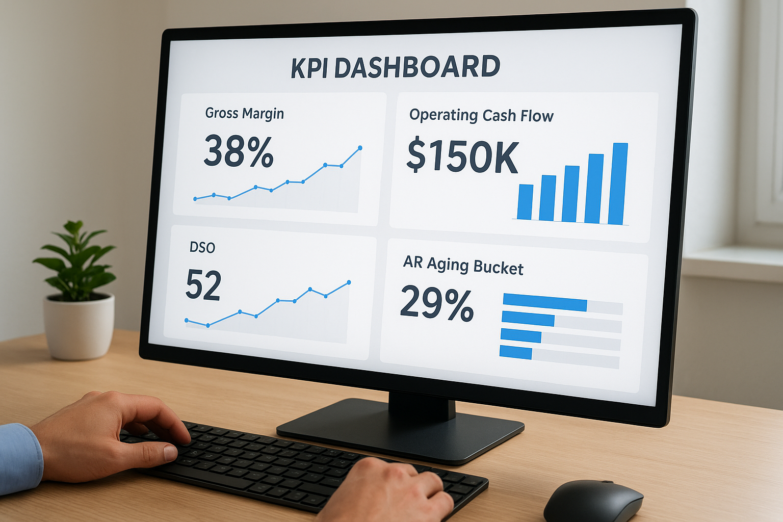
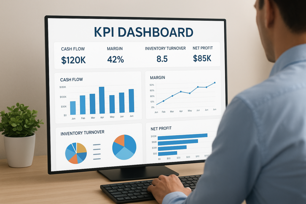
Core financial and operational metrics
Every finance dashboard needs a baseline set of financial KPIs that reflects your company’s health. Beyond those pillars, include key operational metrics tied to performance drivers like inventory turnover or project profitability, depending on your industry. At minimum, consider tracking:
- Gross margin and operating cash flow
- DSO and AR aging buckets
- Budget versus actual variance
- Inventory turnover or order fulfillment rates
The metrics you choose should reflect your specific ROI goals, not a generic list pulled from a template.
Visual clarity and drill-down capability
Once you have the right metrics, how you present them matters just as much as which ones you pick. Use charts and trend lines for time-sensitive data, and simple numerical displays for point-in-time figures like current cash balance or headcount cost.
Your dashboard also needs meaningful filters and drill-down options so users can move from a high-level summary to transaction-level detail without switching tools. When your ERP and dashboard are properly integrated, this depth is already built in, giving your team the ability to diagnose problems, not just spot them.
Types of KPI dashboards and when to use each
Knowing what is a KPI dashboard is only half the equation. The other half is choosing the right type for your specific use case. Finance leaders at midsized companies typically encounter three core dashboard types: strategic, operational, and analytical, each designed for a different audience and decision horizon.
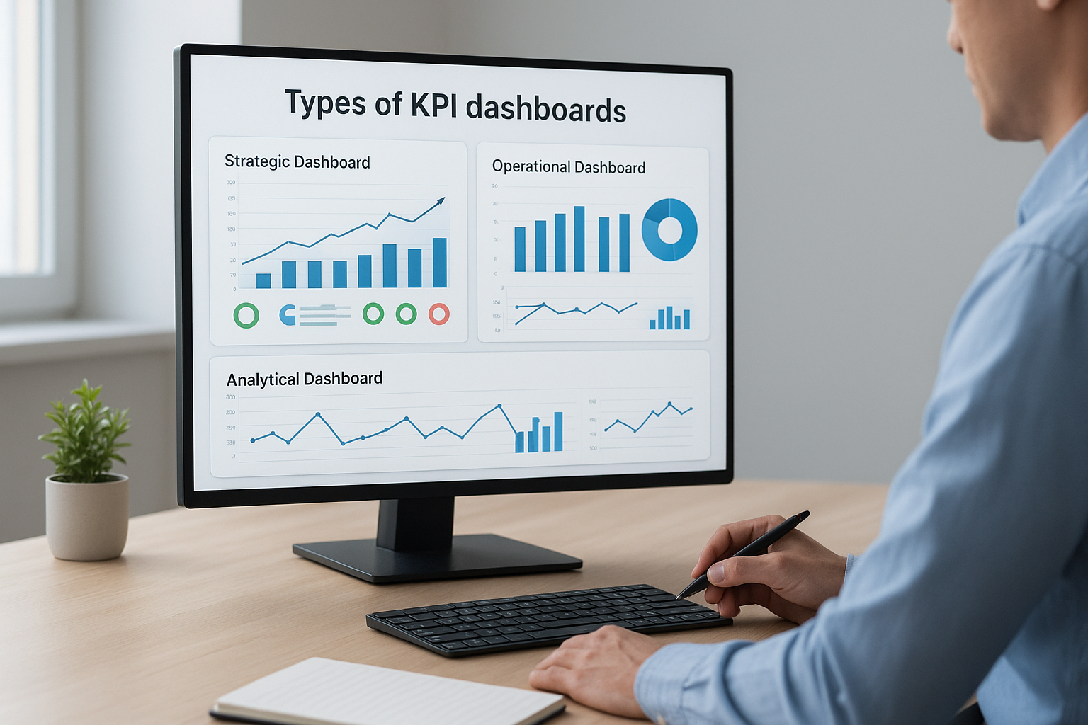
Strategic and analytical dashboards
Strategic dashboards give executive leadership a high-level view of performance against long-term goals. CFOs use them to track whether the business is hitting its annual financial targets, such as revenue growth, margin improvement, and operating cash flow. Data on these dashboards typically refreshes daily or weekly because the decisions they support are directional rather than immediate.
A strategic dashboard answers one core question: are we on track to hit this year’s goals?
Analytical dashboards go deeper, letting your team explore historical trends and diagnose why performance shifted. Controllers and FP&A analysts use these to run variance analysis, model scenarios, and identify root causes behind budget gaps or margin compression.
Operational dashboards
Operational dashboards focus on daily or near-real-time performance and serve teams that need to act fast. Finance teams use them to monitor AR collections, purchase order statuses, and inventory levels as they change throughout the day.
These dashboards surface exceptions and threshold alerts so your team can respond before a small issue compounds into a larger one. When your ERP is properly configured, operational dashboards pull live data automatically, cutting down the need for manual monitoring entirely.
How to build a KPI dashboard step by step
Building a KPI dashboard that actually works starts before you open any software. The most common mistake finance teams make is jumping straight into design without first defining what they need the dashboard to accomplish. A clear build process keeps you focused on outcomes rather than aesthetics, which is what separates dashboards that drive decisions from ones that collect dust.
Start with your financial goals
Before selecting a single metric, define the specific financial outcomes you are trying to track. Ask yourself what questions your CFO or controller needs answered on a weekly basis. If you are still working through what is a KPI dashboard in the context of your own ERP, start by listing the three to five decisions your finance team makes most frequently, then work backwards to identify which metrics support those decisions. Tie each metric directly to a goal from your ROI Roadmap or annual operating plan so nothing ends up on the screen without a clear purpose.
If a metric does not connect to a measurable business outcome, it does not belong on the dashboard.
Connect your ERP data and select your layout
Once your metrics are defined, map each one back to a data source inside your ERP. In NetSuite or Acumatica, this means identifying the records, saved searches, or reports that feed each KPI. Then choose a layout that groups related metrics together, placing your most critical financial figures at the top where they load first. Assign refresh intervals based on how frequently each metric changes, daily for strategic KPIs and real-time for operational ones.
KPI dashboard best practices and pitfalls to avoid
Once you understand what is a KPI dashboard and have built one, keeping it useful over time requires consistent discipline. The most effective dashboards follow a few clear principles, while the ones that fail tend to share the same avoidable mistakes. Knowing both sides keeps your dashboard working as a decision tool rather than an afterthought.
Keep metrics focused and actionable
Your dashboard should contain only the metrics that directly drive decisions, not every figure your ERP can produce. A common mistake is adding KPIs because they are available rather than because they are relevant. Limit each dashboard to eight to twelve metrics at most, and review the full set every quarter to cut anything your team no longer acts on.
A dashboard that shows everything tells you nothing.
Assign a clear owner to each KPI so accountability is built into the structure itself. When a metric moves outside an expected range, someone on your team should already know they are responsible for investigating it and reporting back with a specific corrective action.
Avoid common design and data mistakes
Poor data hygiene inside your ERP will undermine even the best-designed dashboard. If your source records contain duplicates, missing fields, or inconsistent categorization, those problems surface directly in your KPIs. Fix data quality at the source before you build any visualizations around it.
On the design side, avoid overloading your layout with color-coded alerts for every single metric. Reserve visual emphasis for genuine exceptions so your team knows exactly when to pay attention and where to focus.
Where to go from here
Understanding what is a KPI dashboard gives you the foundation, but the real value comes from building one that connects directly to your ERP data and your specific financial goals. The principles in this guide apply whether you are launching a new NetSuite or Acumatica implementation or trying to extract more value from a system that is already live. Start with your outcomes, limit your metrics, fix your data at the source, and review your dashboard regularly so it stays aligned with how your business actually operates.
Your ERP should be the engine behind every KPI you track, which means the quality of your implementation directly determines the quality of your visibility. If your current system is not giving you the clear, reliable data your finance team needs, that is a problem worth solving now rather than later. Connect with the Concentrus team to see how the ROI Roadmap methodology can help you build dashboards that drive real financial outcomes.