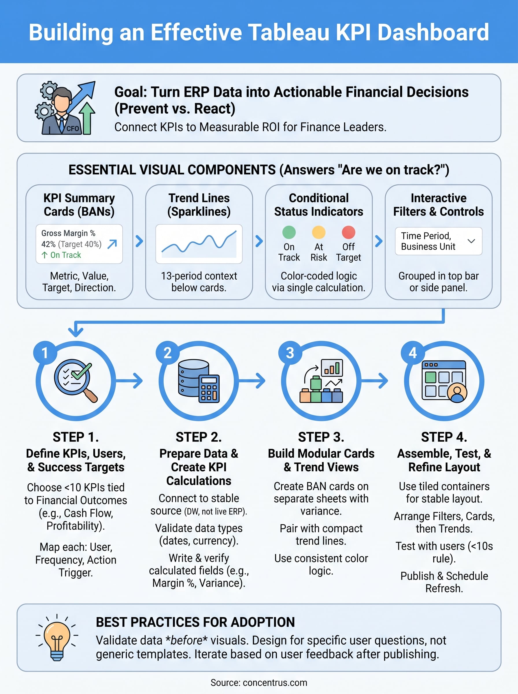
Your ERP system collects the data. But a Tableau KPI dashboard is what turns that data into decisions. For CFOs and finance leaders running NetSuite or Acumatica, the ability to visualize key performance indicators, cash flow, margins, close times, fulfillment rates, means the difference between reacting to problems and preventing them before they hit the bottom line.
The challenge? Most dashboards end up as cluttered report dumps that nobody actually uses. Building one that drives action requires more than dragging a few charts onto a canvas. It takes a clear understanding of which KPIs matter, how to structure them visually, and how to connect them back to the financial and operational goals your ERP was designed to support. At Concentrus, we help midsized companies tie every piece of their ERP investment to measurable ROI, and effective KPI dashboards are a critical part of that accountability.
This guide walks you through building a Tableau KPI dashboard from scratch. You’ll get step-by-step examples, layout strategies, and best practices so your dashboard actually earns its place on someone’s screen. Whether you’re starting fresh or rebuilding something that isn’t working, you’ll leave with a clear framework to follow.
What to include in a Tableau KPI dashboard
Before you open Tableau, you need to know what belongs on the canvas. The most common mistake is treating a dashboard like a spreadsheet, placing every available metric into a grid and calling it complete. What you actually want is a focused set of components that answers specific business questions at a glance, without requiring the viewer to decode anything first.
A well-built dashboard answers one question immediately: “Are we on track?”
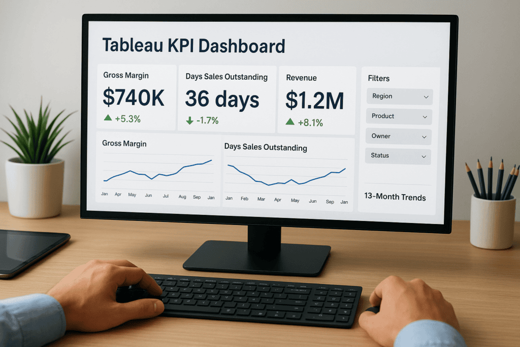
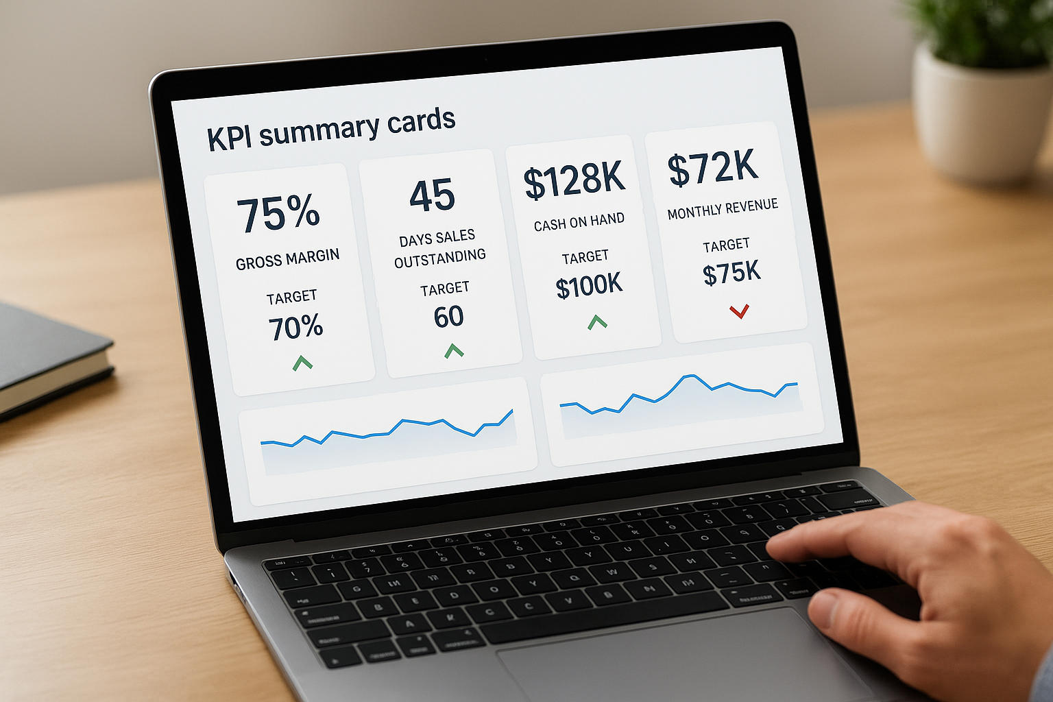
KPI summary cards
The first element your audience should see is a row of summary cards, each showing a single metric alongside its current value, its target, and a direction indicator. In Tableau, you build these using BANs (big number text marks) combined with calculated fields for variance. For finance leaders, typical cards cover gross margin percentage, days sales outstanding, cash on hand, and monthly revenue versus target. Limit each card to three data points: current value, target, and a color-coded arrow driven by a calculated threshold field.
Trend lines and period comparisons
A single number without context tells you almost nothing. Pair each summary card with a small trend line or bar chart showing the last 13 periods, which gives you a full rolling year plus the current month for comparison. In your Tableau KPI dashboard, place these sparklines directly below each card using a tiled container layout to maintain alignment across different screen sizes. This pairing instantly separates a bad month from a bad trend.
Conditional color and status indicators
Color is your fastest signaling tool when it is applied with logic, not aesthetics. Build a calculated field that returns a status string such as “On Track,” “At Risk,” or “Off Target” based on defined thresholds, then apply a discrete color palette to that field across every relevant chart. This keeps all your color logic in one centralized calculation, so when targets change, you update a single field rather than manually editing every visualization on the canvas.
Filters and interactive controls
Your dashboard needs to serve multiple users without becoming a separate custom build for each one. Add dimension filters for time period, business unit, and product line using Tableau’s filter shelf and parameter controls. Use parameter actions to let viewers switch between monthly and quarterly aggregations without navigating away. Keep all filters grouped in a top bar or side panel so they remain accessible without visually competing with the KPI data itself.
Step 1. Define KPIs, users, and success targets
Everything that follows in your build depends on the decisions you make here. Skip this step and you will spend hours building a tableau kpi dashboard that looks complete but answers the wrong questions. Start by identifying no more than ten KPIs for your initial version, because dashboards that try to show everything end up communicating nothing useful to anyone.
The KPIs you choose should connect directly to the financial outcomes your ERP was built to improve.
Choose KPIs tied to financial outcomes
Your KPI list should come from your existing operational goals, not from a generic industry template. For midsized companies running NetSuite or Acumatica, the most actionable finance KPIs cluster around cash flow, profitability, and operational efficiency. Use this starting list and trim it to fit your specific business model:
- Gross margin percentage
- Days sales outstanding (DSO)
- Cash on hand
- Revenue vs. target (current period)
- Operating expense ratio
- Inventory turnover
- Days payable outstanding (DPO)
- Order fulfillment cycle time
Map each KPI to a specific user
Not every viewer needs every metric. A controller watching DSO daily has different needs than a VP of Operations reviewing fulfillment rates weekly. For each KPI, document who uses it, how often they check it, and what action they take when it falls outside the acceptable range. This mapping prevents you from building a single cluttered view when you actually need two or three focused ones.
| KPI | Primary User | Review Frequency | Action Trigger |
|---|---|---|---|
| DSO | Controller | Daily | Exceeds 45 days |
| Gross Margin % | CFO | Weekly | Drops below 38% |
| Inventory Turnover | Ops Manager | Weekly | Falls below 6x annually |
| Revenue vs. Target | CFO | Daily | Variance exceeds 5% |
Step 2. Prepare data and create KPI calculations
Clean, well-structured data is the foundation of any reliable tableau kpi dashboard. Before you build a single visualization, confirm that your data sources are connected correctly and that the fields Tableau pulls match the definitions you set in Step 1. For NetSuite and Acumatica users, this typically means connecting Tableau to a dedicated reporting database or data warehouse rather than pulling directly from live ERP tables, which avoids performance issues and keeps your operational system unaffected.
Connect and validate your data source
Pull your source data into Tableau Desktop using a live connection or an extract, depending on your refresh requirements. Confirm that date fields, currency fields, and dimension hierarchies are typed correctly before writing any calculations. A single mistyped date field will break every time-based comparison on your dashboard.
Validate your data in Tableau’s Data Source tab before writing any calculated fields, not after.
Write your KPI calculated fields
With validated data in place, build each KPI as a calculated field using Tableau’s calculation editor. Below are example formulas for three common finance KPIs:
| KPI | Tableau Calculated Field Formula |
|---|---|
| Gross Margin % | (SUM([Revenue]) - SUM([COGS])) / SUM([Revenue]) |
| DSO | SUM([AR Balance]) / (SUM([Revenue]) / 30) |
| Revenue vs. Target | SUM([Actual Revenue]) - SUM([Target Revenue]) |
After writing each formula, drag it onto a blank sheet and verify the output against a known result from your ERP reports. This cross-check catches calculation errors before they reach your final dashboard layout and saves significant rework later.
Step 3. Build KPI cards and trend views in Tableau
With your calculated fields validated, you’re ready to build the visual layer of your tableau kpi dashboard. Start each KPI on a separate sheet before combining anything into the dashboard canvas. This keeps your build modular and easy to update when targets shift or new KPIs get added later.
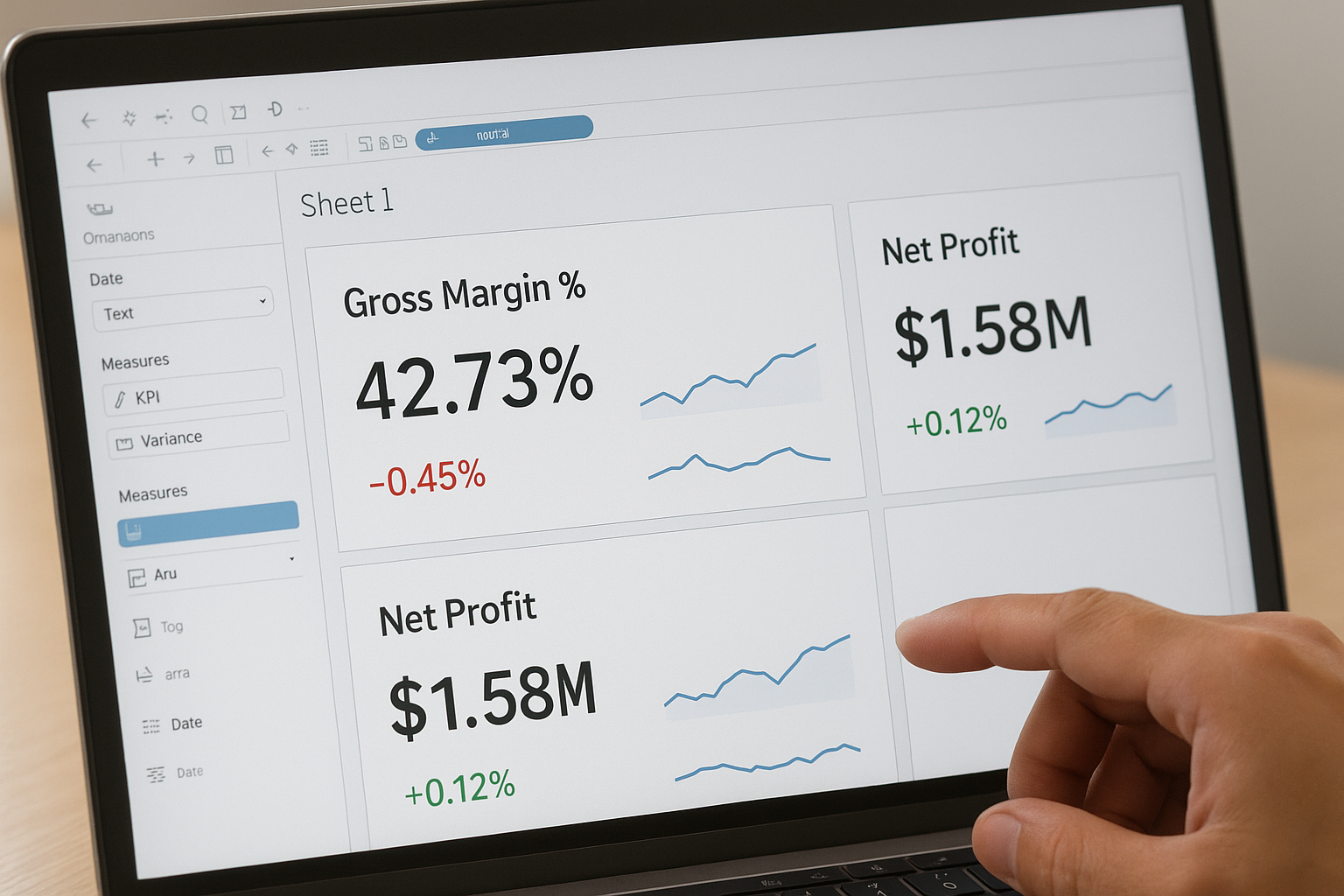
Create BAN cards with variance indicators
Open a new sheet and drag your KPI calculated field (such as Gross Margin %) to the Text marks card. Change the mark type to “Text” and format the number to two decimal places. Then drag your variance calculated field (Actual minus Target) to a second Text mark using a dual-axis setup. Apply a conditional color field to the variance text so it turns green when positive and red when negative. Here is a status calculation you can reuse across all your KPI cards:
IF [Revenue vs. Target] >= 0 THEN "On Track"
ELSEIF [Revenue vs. Target] >= -0.05 * SUM([Target Revenue]) THEN "At Risk"
ELSE "Off Target"
END
Build each KPI card on its own sheet first so you can reuse and update them independently across multiple dashboards without rebuilding from scratch.
Add sparklines for trend context
Pair every BAN card with a small line chart showing rolling 13-month performance. Drag your date field to Columns, set it to Month granularity, and place your KPI measure on Rows. Reduce the row height and remove axis labels so the chart reads as a compact trend indicator rather than a standalone visualization. Set the line color to match your status calculation so the trend reinforces the same signal your card already communicates at a glance.
Step 4. Assemble, test, and refine the dashboard
With your individual sheets built, you’re ready to bring everything together on a single canvas. Open a new dashboard in Tableau, set the size to fixed width (1200px works well for most desktop displays), and drag each KPI sheet into a tiled layout container. Place your BAN cards across the top row with their paired sparklines directly below them, then add your filters along the left panel or top bar. This layout gives your tableau kpi dashboard a clear visual hierarchy that viewers can scan in seconds rather than spending time decoding the structure.
Arrange and align layout containers
Tiled containers keep your layout stable across different screen resolutions, so use them rather than floating objects for core content. Group related KPI cards and sparklines into horizontal layout containers before placing them on the canvas. When you resize one container, all elements inside shift proportionally rather than breaking alignment. Lock your filter panel width to 200px to prevent it from collapsing or expanding unexpectedly when a user interacts with the controls.
Test with real users before publishing
Send a draft link to two or three actual users, your controller or your ops manager, and ask them one specific question: “Can you answer your primary business question within ten seconds of opening this?” If the answer is no, simplify. Remove any chart that requires explanation. Check that all filter interactions update every sheet correctly by testing each dimension and time period combination systematically.
A dashboard that passes internal review but fails in the hands of actual users tells you the problem is in the design, not the data.
Refine based on that feedback, then publish to Tableau Server or Tableau Cloud and set your data extract refresh schedule to match the review frequency you documented in Step 1.
Next steps
You now have everything you need to build a tableau kpi dashboard that your finance team will actually open and use. You started with defining the right KPIs, mapped them to real users and thresholds, validated your data, and built a modular layout your team can maintain and update without starting over each quarter.
The next move is to publish your dashboard and run one full review cycle with actual users before locking in the design. Track which filters they use most, which KPIs prompt the most questions, and which charts get ignored. That feedback tells you exactly where to simplify and where to add detail in your next iteration.
Building an effective dashboard is only part of the equation. If your ERP data is incomplete or misaligned with your financial goals, your dashboard will reflect that gap. Work with an ERP and ROI expert to make sure the data feeding your dashboard drives real, measurable outcomes.