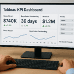
A Power BI KPI visual turns raw ERP and financial data into a single, focused indicator that tells you whether you’re hitting your target or falling short. For CFOs and finance leaders tracking metrics like gross margin, days sales outstanding, or monthly close time, this visual type cuts through dashboard noise and delivers immediate clarity on performance.
But dropping a KPI card onto a report isn’t the same as using it well. The wrong setup, mismatched goal lines, poor trend indicators, or cluttered formatting, can mislead decision-makers instead of empowering them. Getting it right means understanding what the visual actually does, how to configure it against meaningful benchmarks, and which design choices make your reports actionable rather than decorative.
At Concentrus, we help midsized companies build ERP systems on NetSuite and Acumatica that produce clean, reliable data worth reporting on. The KPI visuals you build in Power BI are only as good as the data feeding them, and that starts with a well-implemented ERP. This guide walks you through what Power BI KPI visuals are, how to set them up step by step, and the best practices that separate useful dashboards from ones people ignore.
What a KPI visual shows in Power BI
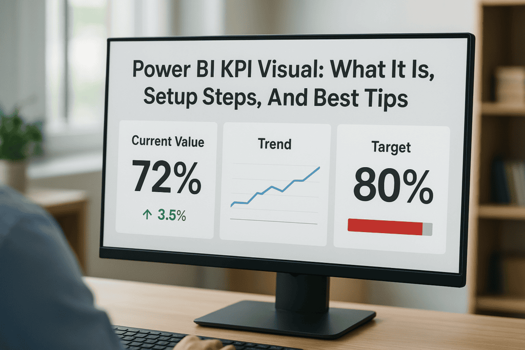
A Power BI KPI visual is a compact, purpose-built visualization that measures one value against a defined target and shows you trend direction over time. Unlike a bar chart or scatter plot, it doesn’t ask you to interpret patterns across multiple data points. Instead, it answers a single question instantly: are you ahead or behind where you need to be? That directness is exactly why finance leaders reach for it when building executive dashboards.
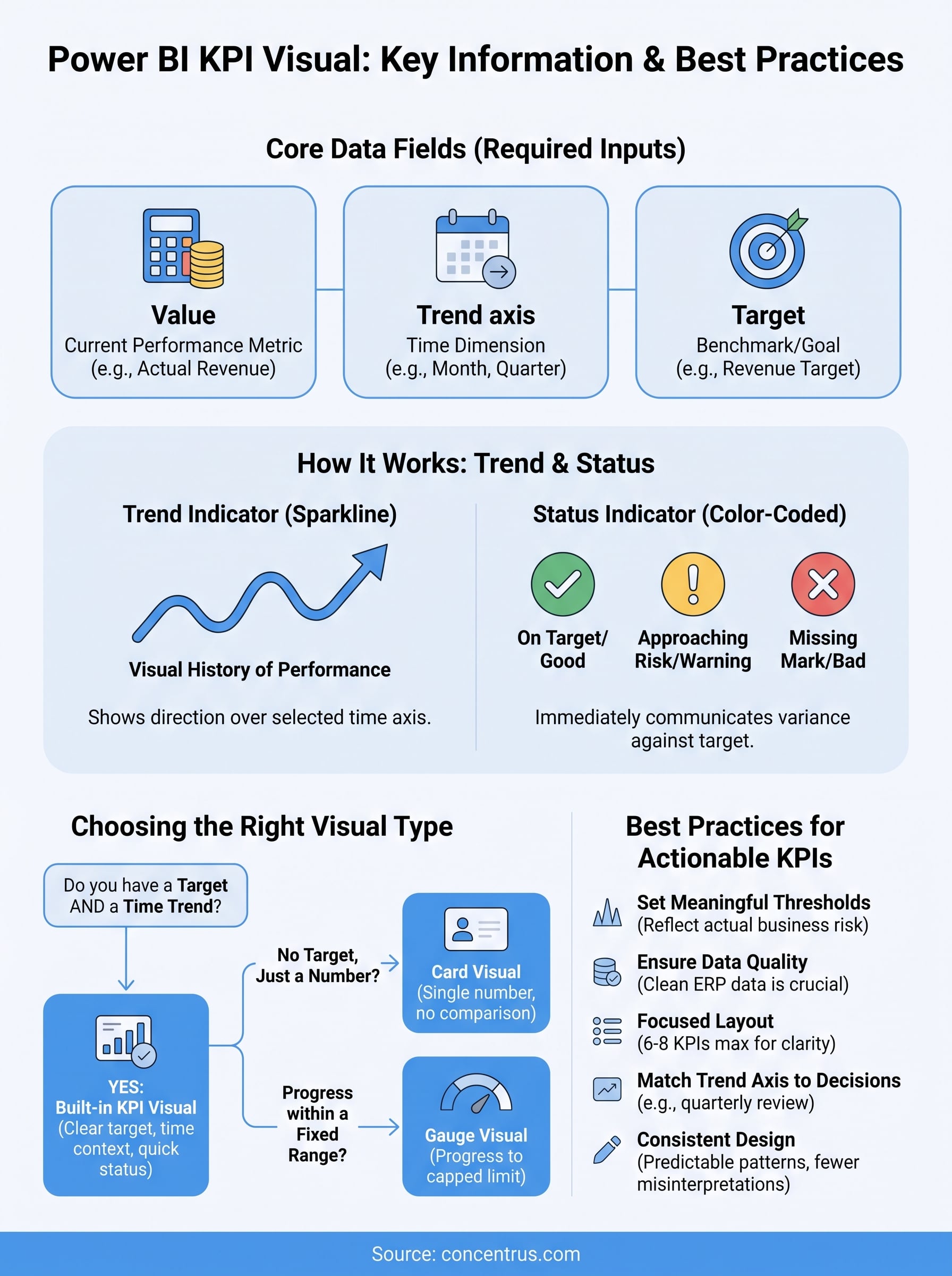
The three core data fields
Every KPI visual in Power BI is built around three required inputs that you map to your data before the visual renders correctly. Without all three, the visual either breaks or gives you incomplete information.
| Field | What it represents | Example |
|---|---|---|
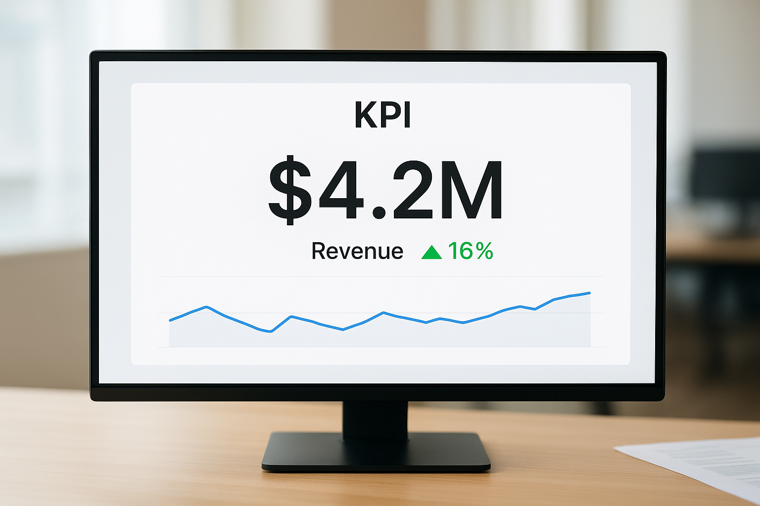
| Value | The actual current performance metric | $4.2M in revenue this month |
| Trend axis | The time dimension that drives the trend line | Month, quarter, fiscal period |
| Target | The benchmark or goal you’re measuring against | $5M monthly revenue target |
Power BI calculates the variance between your value and target automatically and then applies a color code, green when you’re meeting or exceeding the goal, red when you’re falling short. You control which direction counts as “good,” so a metric like days sales outstanding correctly flags improvement when the number drops rather than rises.
How the trend indicator works
The trend line sits beneath the main KPI number and gives you a visual history of performance across your selected time axis. If your trend axis is monthly and you’re looking at a fiscal year, the spark line reflects how your metric moved across each of those months. This matters because a single number can be misleading without context: hitting your target in March looks different if the prior four months were all misses.
The trend line tells you where you’ve been; the status indicator tells you where you stand. You need both to make a confident decision.
Power BI automatically scales the trend axis to fit the visual’s width, which means the axis labels can disappear on smaller dashboard tiles. If your KPI card is small, the trend becomes harder to read and you may need to resize the tile or switch to a different visual type for that specific metric.
What the status indicator communicates
The status indicator is the color-coded signal that sits next to or beneath the main value. By default, Power BI uses green, yellow, and red to communicate whether performance is on target, approaching risk, or missing the mark. You can adjust the threshold logic in the formatting pane, which lets you define exactly what percentage above or below target triggers each color.
Finance leaders working with NetSuite or Acumatica ERP data pulled into Power BI should pay close attention to how the status thresholds are configured. A target that’s technically met by 1% looks the same as one exceeded by 20% unless you set meaningful tolerance bands. Sloppy threshold settings produce misleading status colors that erode trust in your dashboards over time.
Why KPI visuals matter for finance leaders
Finance leaders don’t have time to dig through raw tables or reverse-engineer charts to find out whether a metric is on track. A power bi kpi visual removes that friction by surfacing the answer immediately, so you spend your limited attention on decisions rather than interpretation. When you’re managing close cycles, reviewing cash flow, and fielding board questions at the same time, speed and clarity in your dashboards directly affect the quality of your financial decisions.
Speed matters when data changes daily
Your data doesn’t stand still. Revenue figures update as sales close, receivables shift as payments come in, and inventory costs move with every supplier invoice. If your reporting tools require you to rebuild context each time you open a dashboard, you lose the ability to act on information while it’s still relevant. KPI visuals solve this by giving you a persistent, at-a-glance signal that updates automatically when your underlying ERP data refreshes.
The faster you can confirm a metric is on track, the more time you have to investigate the ones that aren’t.
This speed advantage compounds across a finance team. When your controller, FP&A analyst, and CFO all read the same KPI card in seconds, fewer meetings get scheduled just to align on what the numbers mean, and more conversation focuses on what to do about them.
KPI cards reduce misinterpretation across your team
A bar chart or line graph gives you information, but it also asks you to interpret direction, scale, and magnitude. Different people read the same chart differently, especially under pressure. KPI visuals impose a shared standard for what “good” looks like by encoding your target and tolerance directly into the visual logic.
When you set your thresholds correctly, every person viewing the dashboard reads the status color the same way. That consistency matters most in cross-functional reporting environments, where finance data gets reviewed by operations, sales leadership, and executive stakeholders who don’t share your level of familiarity with the underlying metrics. Fewer interpretation gaps mean fewer errors in the decisions those metrics are supposed to drive.
How to set up the built-in KPI visual
Setting up a power bi kpi visual takes only a few minutes once your data source is connected and your fields are clean. The built-in KPI visual ships with Power BI Desktop by default, so you don’t need to install anything from the marketplace before you start.
Add the visual to your report canvas
Open your report in Power BI Desktop and click the KPI icon in the Visualizations pane. It looks like a small upward arrow next to a number. Power BI drops an empty KPI card onto your canvas immediately. Resize and position it before you map your data fields, because repositioning after field mapping doesn’t affect your configuration but keeps your workflow cleaner.
Map your three required data fields
With the KPI visual selected, you’ll see three field wells in the Visualizations pane: Value, Trend axis, and Target goals. Drag your performance metric (such as revenue or gross margin) into the Value well. Drag your time field (month, quarter, or fiscal period) into the Trend axis well. Then drag your goal or budget figure into the Target goals well. Power BI renders the visual as soon as all three fields are populated.
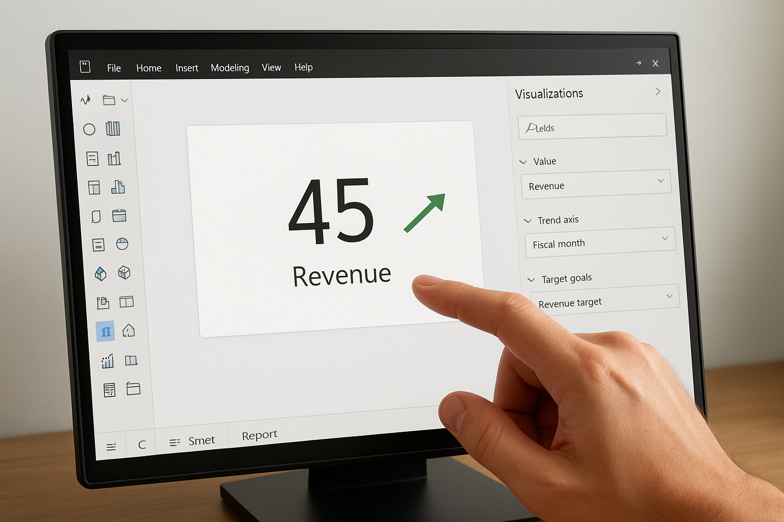
If your target field is a fixed number rather than a column, create a calculated measure in DAX first, then drop that measure into the Target goals well.
| Field well | What to drag in | Common example |
|---|---|---|
| Value | Your actual performance measure | Actual revenue (measure) |
| Trend axis | A date or period field | Fiscal month |
| Target goals | Your budget or goal measure | Revenue target (measure) |
Adjust your status direction and thresholds
After your fields are mapped, open the Format pane and locate the “Trend axis” and “Goals” sections. Set the direction toggle so Power BI knows whether a higher or lower value is favorable for your specific metric. Then define your threshold percentages to control when the status color shifts from green to yellow or red. Use tolerance bands that reflect real business risk, not arbitrary defaults, so your status colors carry genuine meaning for everyone reading the dashboard.
Choosing the right KPI visual type
The built-in power bi kpi visual is not always the best fit for every metric on your dashboard. Power BI offers several visual types that each serve a different reporting purpose, and picking the wrong one forces your audience to work harder to extract meaning from your data. Matching the visual type to what your metric actually needs to communicate keeps your dashboards readable and your stakeholders focused on decisions rather than interpretation.
When the built-in KPI visual fits
The built-in KPI visual works best when three conditions exist simultaneously: you have a clear numeric target, the time-based trend provides meaningful context, and your audience needs an instant pass-or-fail signal without digging deeper. If any one of those conditions is missing from your scenario, a different visual type will serve you better.
Common finance metrics that fit the built-in KPI visual well include:
- Revenue versus monthly or quarterly budget
- Gross margin against a minimum acceptable threshold
- Days sales outstanding compared to a collection target
- Operating expense ratio measured against a cost ceiling
Use the built-in KPI visual when the trend behind the number matters as much as the number itself.
When to use a card or gauge instead
A card visual is the right choice when you need to display a single number with no target comparison and no trend context, such as total headcount or a one-time capital expense. It is clean, fast, and impossible to misread in a crowded dashboard. A gauge visual works better when you want to show progress within a fixed range, like capacity utilization capped at 100%, because the arc format communicates proximity to a limit more intuitively than a status color alone.
Here is a quick reference to help you decide:
| Visual type | Use it when | Avoid it when |
|---|---|---|
| Built-in KPI | You have a target and a time trend | No time axis exists in your data |
| Card | You need a single number, no target | Trend context matters to the decision |
| Gauge | Progress within a fixed range | The range has no natural cap |
Selecting the right visual type before you build saves you from reformatting reports after stakeholders raise questions, and it keeps every dashboard communicating clearly from the first glance.
Design tips and common mistakes to avoid
A well-configured power bi kpi visual loses its value the moment poor design choices make it harder to read or easier to misinterpret. Formatting decisions like color selection, tile sizing, and label placement directly affect how quickly your audience extracts meaning from a dashboard, so treating design as an afterthought leads to reports that confuse rather than inform the people who rely on them.
Keep your layout focused and consistent
Your KPI visuals should follow a predictable layout pattern across your entire report. When each card uses the same font size, color scheme, and tile dimensions, readers build a mental model quickly and spend less time reorienting between sections. Inconsistency forces your audience to slow down and second-guess what they’re looking at, which reduces the speed advantage that KPI visuals are supposed to provide.
Limit your dashboard to the metrics that drive active decisions for your team. Filling a report with every available KPI creates visual noise that pulls attention away from the numbers that actually matter. A focused set of six to eight KPI cards almost always outperforms a crowded grid of twenty, because your stakeholders can read the critical signals at a glance without filtering out irrelevant data first.
Mistakes that undermine your KPI reports
The most common mistake finance teams make is leaving the default status thresholds unchanged after adding the visual to their canvas. Power BI’s default tolerance settings rarely match your actual business risk tolerance, which means status colors flip at meaningless points and gradually erode confidence in your dashboards. Always open the Format pane and set thresholds that reflect real operational boundaries specific to each metric.
Letting default settings define your performance thresholds is the same as letting Power BI decide what success looks like for your business.
Another frequent error is mismatching the trend axis granularity to the reporting period your audience uses. If your stakeholders review performance quarterly but your trend axis is set to daily, the spark line becomes compressed and unreadable at standard tile sizes. Match your time grain to the cadence at which decisions actually get made, and your visuals will communicate clearly every time.
Final takeaways
A power bi kpi visual works best when it connects a reliable data source, a clearly defined target, and a time axis that matches how your team actually makes decisions. The three core fields, value, trend axis, and target, are not optional placeholders. They are the foundation that determines whether your status colors reflect real performance or mislead the people reading your reports. Choosing the right visual type, setting thresholds that reflect actual business risk, and keeping your layout consistent across every dashboard tile all contribute to reports your stakeholders will trust and use.
Your KPI visuals are only as strong as the data behind them. If your ERP system produces inconsistent or incomplete data, no amount of formatting will fix the output in Power BI. Getting your foundation right is where the real leverage lives. If you want to build reporting that actually drives decisions, talk to our ERP and ROI experts at Concentrus.